Project Details
Overview
The Wawa Kiosk Redesign project aimed to improve the self-service food ordering experience - specifically for breakfast sandwich orders - by identifying user pain points and optimizing the flow for speed, clarity, and satisfaction. As part of a collaborative UX Master's project, our team worked to uncover how real users interacted with the kiosk and what friction points were affecting their ability to order quickly and confidently.
Problem Statement
How might we reduce user errors and improve efficiency when placing breakfast sandwich orders at the Wawa self-service kiosk?
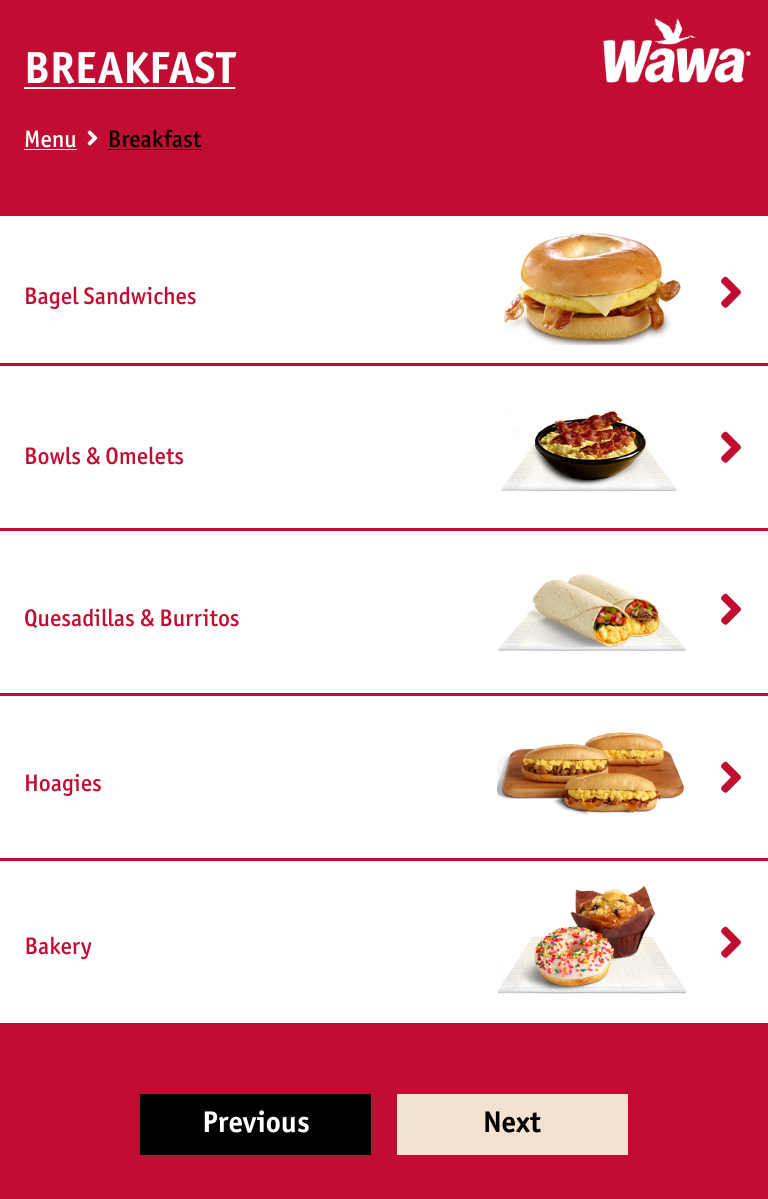
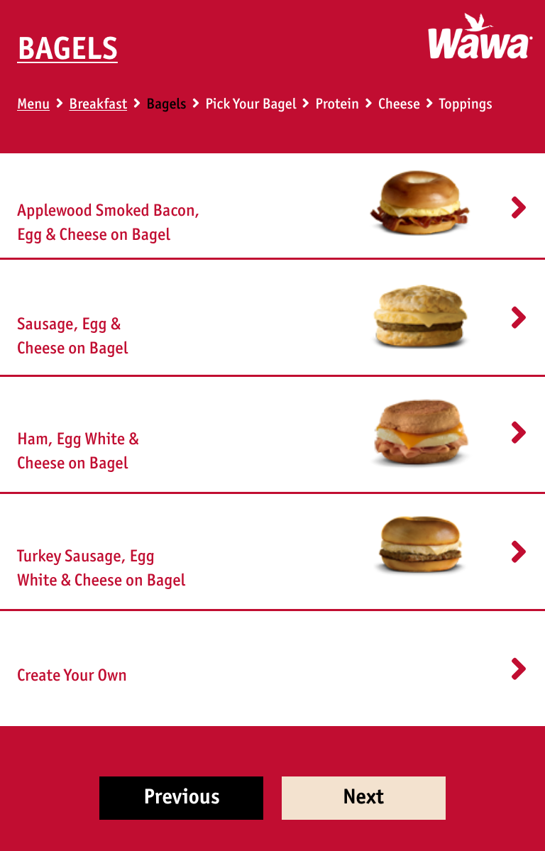
Wawa's current kiosk system offers a variety of menu items, but many users struggle during the breakfast sandwich ordering process, encountering unclear steps and limited customization options.
Research Goals
We set out to understand user needs and uncover pain points in the food ordering process to identify opportunities for creating a smoother, faster, and more intuitive experience - especially during high-volume morning hours.
Key Research Findings
After conducting observational research and user testing, we identified two main opportunities for improvement:
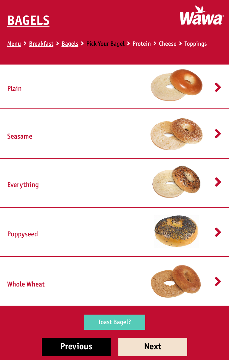
1. Lack of a "Build Your Own" sandwich feature
Users felt constrained by pre-set sandwich options. A customizable feature would reduce confusion and increase satisfaction.
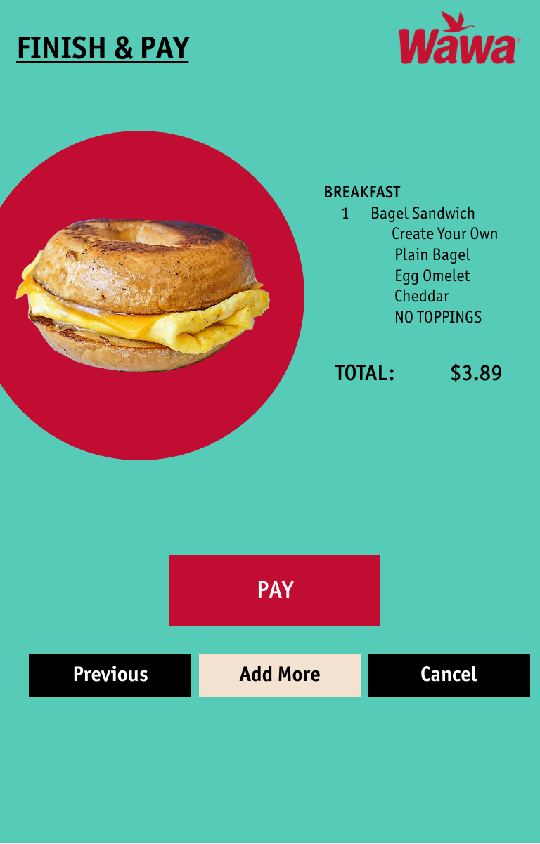
2. No Option to Pay at the Kiosk
Users were frustrated by the additional wait to pay at the cashier, especially during the morning rush. Paying directly at the kiosk would streamline the process and reduce congestion.
Who was Involved
This project was a team collaboration with two other UX designers during our Master's program. Each team member contributed to research, ideation, prototyping, and testing.
Our Process
User Observation & Testing
We observed users navigating the kiosk and noted repeated points of confusion, particularly in the sandwich customization flow.
Affinity Mapping & Journey Mapping
Using insights from user testing, we mapped out common friction points and emotional highs/lows across the ordering journey.
Ideation & Wire-framing
We brainstormed ways to simplify the flow and integrate key features, such as drag-and-drop sandwich building and an intuitive payment step.
High-Fidelity Prototyping
Using Figma, we created a clean and accessible interface, emphasizing clear hierarchy, larger buttons for quick selection, and intuitive customization paths.
The Final Product
The redesigned Wawa Kiosk experience featured:
- A "Build Your Own Sandwich" flow with step-by-step ingredient selection
- A "Pay at Kiosk" feature, reducing checkout time and foot traffic
- Improved screen layouts that minimized error-prone selections
- A streamlined, high-contrast design optimized for quick interactions
Reflection & Next Steps
This project showed how subtle design changes in a high-traffic, self-service context can dramatically improve usability.
If expanded further, we'd recommend:
- Testing the redesign in live environments
- Adding accessibility features like voice ordering or haptic feedback
- Exploring loyalty rewards integration to further incentivized kiosk use